Re-imagining banking
What could your bank do for you that it isn’t doing? Could your banking experiences be better?
The banking landscape is changing. An increasing amount of digital banks are coming to market and new services are becoming available. What does this mean? People are no longer tied to the traditional way of banking. Advances like the EU’s Payment Services Directive 2 allows more opportunity for new entrants to innovate and create better banking experiences for customers. Essentially, we are entering a new era of finance.
Tribe Digital is a digital product agency based in Dublin, and my workplace during the summer of 2019. Tribe was looking to do a case study on designing a concept digital bank, which became one of my projects. I’ll take you through the design process and how I set out to create the Tribe Bank.
Research + Ideation
What are digital banks doing now? What are the best digital banks that exist and what makes them excel? What are all the features that are available - and soon to be available - and how do they help make the banking experience better?
I was given a list of some of the top digital banks and I found some others that were interesting as well. I was also given a list of features that I ought to include in the first round of testing. I then began walking through the flows of the banks in order to get a solid understanding of the user journeys. I made notes of interesting features, and of what I personally liked and didn’t like about each one.
After I’d gathered some insights, I began sketching quick wireframes - pulling elements from different sources and putting the pieces together. At this point a lot of experimentation is happening. I’m seeing what I think might work and what definitely doesn’t. What would be interesting to test, and what seems to be standard across every app. I’m determining what is superfluous, and focusing on the essential - what are the user’s goals? What do users need to reach their goals? What’s the easiest way for them to do that? Here’s a scan of the payment flow wireframe sketch:
Design
When I had a clear list of user-flows and features, I started to design higher fidelity wireframes with Adobe XD. My focus during this period was on setting the information architecture and linking between flows in a way that intuitively aligns with the user’s goals. Everything was being geared toward usability. Here is what the first version of wireframes looked like for 2 of the flows:
Testing & Re-design
I did three rounds of usability testing with 3-5 users each round. The first round was with the set of wireframes above. The test started with a survey about the user’s current banking experiences and practices to determine if they are within the target audience. I then gave them a set of tasks to complete that included common ways the app would be used. While they were completing the tasks I was assessing how difficult they were to complete. At the end of the session I gave them more time to explore the app and share their thoughts.
After each of the three rounds I made a prioritized list of changes, and updated the wireframes accordingly.
One of the most important changes was separating accounts and payments. Users found it confusing to have these both accessible from the same page. The analytics section was also redone. The graphs were removed to improve clarity and new sections were added, including being able to see monthly subscriptions.
The largest change that resulted from the testing was a value proposition pivot. Originally, the app was set up as a new digital bank with it’s own card and account. The goal was to make something that people would be excited about using as their only bank. However, insight from testing made it clear that users are not willing to completely abandon the traditional banking system for the following reasons:
The hassle of switching all their bills
The ability to receive financial advice
The ability to receive loans and set up mortgages
This led to a pivot. Instead of Tribe Bank being its own bank, it can be a place where you link your existing accounts. This way users can bank using only the Tribe Bank app no matter how many accounts they have. For financial advice, users can access easy-to-understand resources through the app or live chat with financial advisors. Loan functionality was initially built in, but it was expanded to cover mortgages as well.
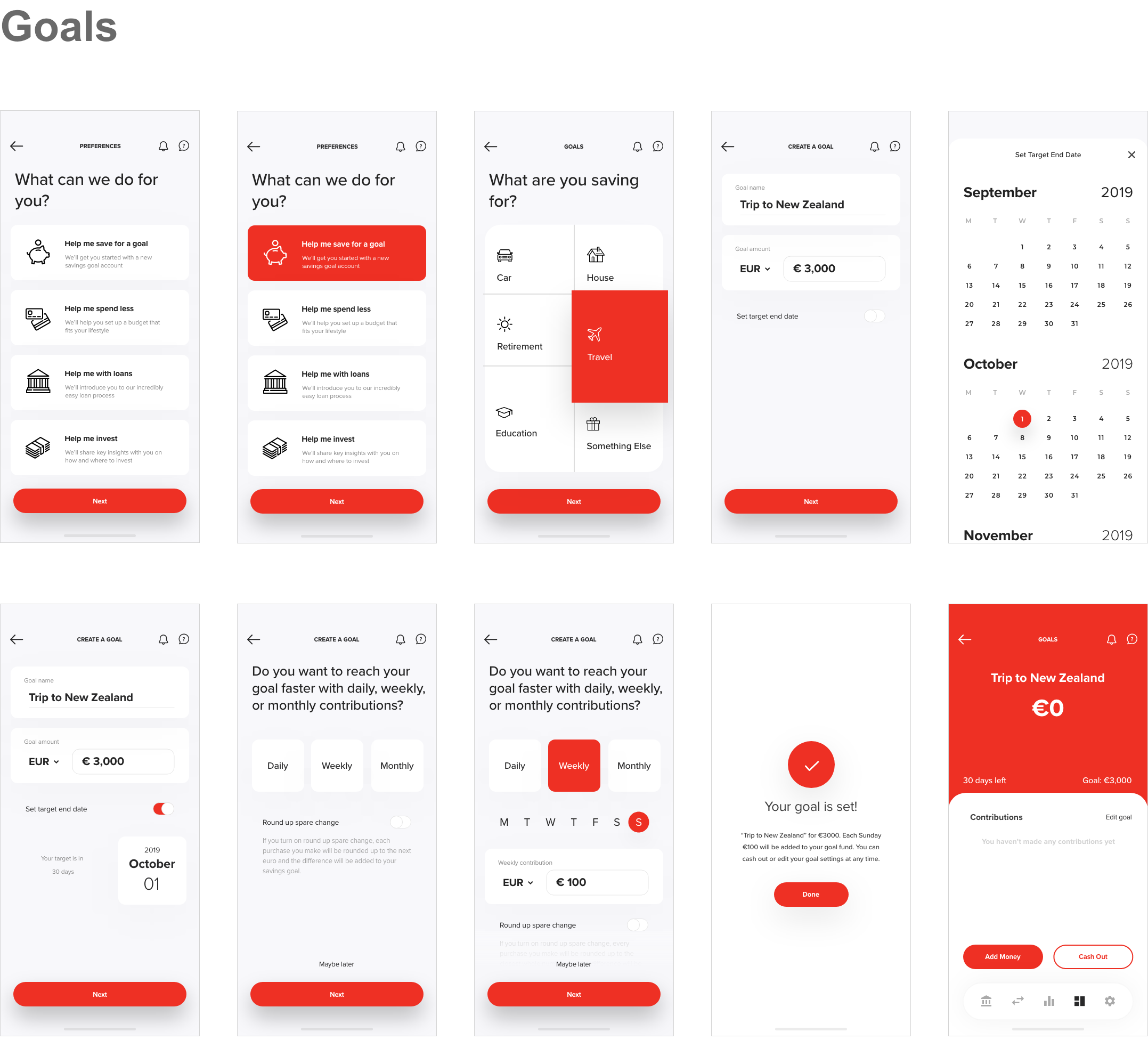
After these changes were implemented in the wireframes, I created a high-fidelity prototype. Here are what the same flows from above look like now:
Final Thoughts
The ideas presented with Tribe Bank are a result of design thinking. They are meant to build both a usable and enjoyable product. As a concept this project was interesting, however the challenging part is to create a banking product that delivers both real value while adhering to the equally real constraints that exist in the world – and that would be an excellent challenge.


